The brief
A practitioner was opening a new skin and aesthetics clinic and needed to be found and contacted from day one. She wanted a look that felt calm and personal, never pushy, and a website that explained her treatments honestly.
Aesthetics is a sensitive area to market. Some treatments are prescription medicines, which strictly limits how they can be named and promoted, and claims about results or wellbeing have to be handled with care.
My process
Discovery. I started with her own words: her bio and her description of each treatment. I also looked at how other clinics in the area presented themselves, what they did well and where they fell short.
Plan. I set out a clear scope in three tiers: what had to be in place to launch, what would make a strong launch, and what could wait until later. She made the key decisions, such as keeping booking to phone and email at first.
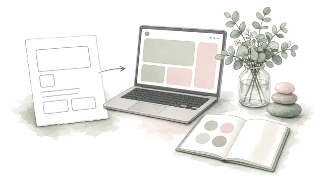
Design. I produced brand guidelines and a set of typeface options for her logo, followed by page designs. When her opening date came close, I narrowed the first version down to a single homepage, so she'd have something useful straight away rather than waiting for a full site.
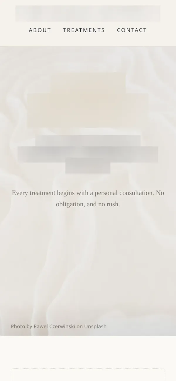
Build. I turned the chosen design into a fast, simple page that works well on a phone. It collects no visitor data at all: no forms, no tracking, no cookie banner. Her details are kept in one place, so adding them is a one-line change.
Testing. I checked the page carefully against the advertising rules: prescription treatments are never named by brand, there are no invented credentials, reviews or figures, and health claims are worded as she wrote them. While preparing the logo files for print, I found they were displaying in a font that couldn't legally be used on signage. I stopped the print files before anything went out and offered twenty properly licensed alternatives.
Handover. The design is ready and waiting for her final choices on the logo, web address and contact details.
What I delivered
- Brand guidelines
- Twenty licensed typeface options for the logo
- Research into the local market, and a scoped plan
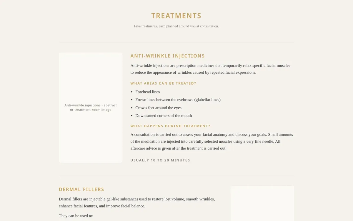
- A finished one-page homepage design, built for phones and ready to go live
The outcome
This is a homepage design, not a live website. It's finished and ready to publish once the client confirms her final details, and the project is paused until she's ready. Along the way, careful checking stopped a font licensing problem before it could reach a printed sign.